Interview with artist/illustrator Tom Hodge
– by Robin Bougie
Actors, directors, screenwriters, special effects guys, and composers. The media is fascinated with the cult of personality that make up the front lines of the film industry, and everyone seems to care about what these particular people have to say. But you know who never gets interviewed? You know who never gets to sit in the media spotlight?
A person who is just as talented and as devoted to his craft as any of the aforementioned individuals: the dude who toils away creating the movie poster.
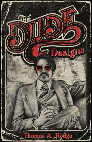
One such dude is a dude who literally signs his work “dude”. I know him better as Tom Hodge, the outrageously talented British wunderkind who has come out of nowhere to take the cult film poster world by storm. I recently had the chance to chat via email with Tom about what it is he does, and the state of the movie poster.
Robin Bougie: Hi Tom. Thanks for chatting. First off, let us hear about your artistic background. Did you go to art school?
Tom Hodge: I have always been a creative kind of guy and drawing from an early age and got a buzz from producing something tangible, which as you start to work in the creative industries, you realize is NOT as easy to do as you would think. I remember drawing all sorts if crazy stuff when I was young. My cousin and I got into Rambo, Commando and all those sort of action films when we were around six, so I guess that’s where all my interest in posters and trash art started. I also got into drawing on a computer with my Atari ST. Around the same time I started collecting old horror films (which I recorded off TV) which I would make my own video covers for.
School was not the greatest experience for me, so I got into art school through doing two years at college, which was invaluable. I learned most of my technical skills there, and won an award for the highest achievement in design at the end, which was cool. University, however, was a bit of a buzz-kill – and I did not get along with the lecturers. I did learn to drink though, so it was an invaluable experience. NEVER challenge a Welsh rugby player to a drinking contest!
The more I got into design, the more technical it became and the further away I seemed to get from finding my niche in the world of art. I’d go around to design expos and read magazines, wracking my brain trying to figure how I could bring out my own style in the work – combining my design skills and my personality into what I love. It has only been over the past three years or so with the blog and freelance work I’ve picked up that has allowed me to develop my style. The exploitation art is the result of a winding, year-long road. I feel like there is still a lot of hard work ahead.
RB: Well, you seem to be in the right place and time to take advantage of what appears to be a small spike in interesting film poster design.
TH: Yeah, film poster art hasn’t been the most creative industry up until recent times, with the 1990s being a very low point indeed. But now people are starting to appreciate well illustrated poster art again. This really has had a lot to do with all the online forums, blogs and websites which are displaying collections of all these old obscure posters and video covers. It showcases this art form for people to discover this work for the first time, and then they are wanting to see that quality level within the industry now. The viewers are becoming a lot more savvy and visually educated via the Internet. A couple of badly Photoshopped heads plopped on a poster just won’t cut it anymore.
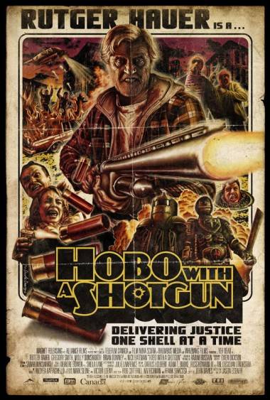
RB: Your Hobo with a Shotgun theatrical poster is, in my opinion, one of the single finest pieces of filmic poster art from the last 10 years. Seriously.
TH: Well, thanks. I’m humbled, man. I just did what I know, and the guys ran with it – which was cool. Usually these things go through lots of amends. If a marketing department was involved, you wouldn’t have got the poster coming out like that. It’s totally raw.
RB: Well, how did that art job come about? I’d also like to hear about your process of creating it.
TH: I generally read a lot of film news/press sites, so I know what’s going on. Because of that I knew about Hobo from the whole Grindhouse thing [ed. note: Hobo started off as a fake trailer for the Rodriguez/Tarantino 2007 B-movie homage Grindhouse], and then when I saw they had Rutger Hauer attached, it really sparked my interest. I wasn’t excited by the first piece of poster art they first released, and the film hadn’t yet been picked up for distribution, so I knew there was a window of opportunity. So I just sent an email saying “Hey…” The email found its way to the director and producer, who really liked my stuff, and they were like “Great! We’d love to see what you can come up with!” That was it, man!
The funny thing is that they might have thought I was a chancer looking for some photos to post online, so they weren’t taking any chances. Consequently, I had nothing to work with at all, apart from the online trailer and what I could grab off the web. I did the old Drew Struzan technique of taking some photos of myself posing for reference. That is actually my body on the poster, not Hauer’s. What you see is what I drew straight off the bat. It is pulled from so many mental references of film posters. I love that it just came together, and I had no time to look back because it was a very small window of opportunity, and a tight deadline.
Hopefully there will be the money available to do these sort of posters in the future, because it is quicker and cheaper to knock out some Photoshopped promo shots of the actors with a colour wash, but it takes me considerably longer to turn around one of my designs. I feel people pick up on the care and consideration which goes into this artwork, though. Being from the computer age myself, I do all of my work digitally (due to cost and time) but I’m trying to merge the two styles by using technology in a very old school way.
RB: I’m glad you got their attention. I’m sure they saw what I see, which is a young up-and-comer who is something of a call-back to the old cats who had the artistic chops. I mean, what the shit happened to the art form of the painted film poster, Tom? Where are the old guard of talented artists that created poster art in the ’70s and ’80s? I miss them!
TH: What happened? Control, money, time, demographics, and market research happened! Just read The Art of Drew Struzan book for a brilliant rant against the whole thing, man. Director Frank Darabont comments in the intro: “Suits tell you with the conviction of a brainwashed cult member that painted movie art is too old-fashioned and quaint to have any appeal to modern audiences. ‘People don’t get it’… ‘Oh, we poll the public on if they prefer the painted art or the crappy computer-generated stuff, and the crappy computer generated stuff wins hands down every time’.”
Drew has retired, but people like Graham Humphreys (who I have had the pleasure of meeting) are still going. He designed all the classic UK artwork for the Evil Dead films, Friday the 13th, etc. They may get hired for one-off specials or special versions of the poster, but I think only recently has public favour swung around again to this style of artwork for films and DVDs. Hopefully we should see a lot more of it, and I think things should be on the change.
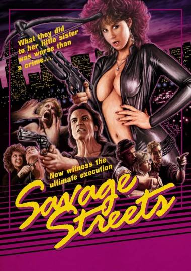
RB: Another poster you did, this time for a UK dvd release, also blew my balls off. Your Savage Streets poster. Tell us about that movie, and what you were trying to achieve with your art for it.
TH: Well, thanks again! I hope the balls are back in working order, now!
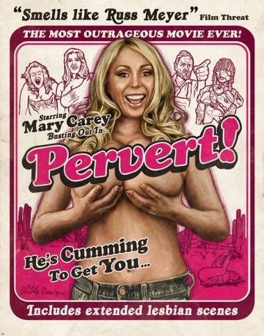
Savage Streets is *the* quintessential ’80s-style VHS vigilante film, complete with a punk gang and sexy girls. Because of that, I wanted to go all out and do a really stylized video cover. I hadn’t brought in much sexuality into my work up to that point, but I had two jobs at the same time that demanded it: Pervert! and Savage Streets.
The ending of the movie is brilliant. Linda Blair is off on this angry vigilante killing spree, but first does the makeup, puts the earrings in, and gets into the black jumpsuit. I’m not sure about her motivation behind all this, but it says a lot about the film. I think you have to be quite theatrical in your design approach for this kind of project, and go totally over the top with elements like guns, boobs, flames, blood… what have you! Make it all 30 per cent bigger so people can really see it.
RB: What projects are in the works for you these days? What can we look forward to from the Dude?
TH: Well, I’m going through quite a few posters in a row at the moment. I have polished three off, which should be out any day. One is for a film called Patch Town (a strange Brazil-meets-Clockwork Orange musical), and two slasher films. I’m a big horror fan, so it’s cool to get my teeth into them. The Legend of the Psychotic Forest Ranger is a dark humour 1980s homage, and Madison County is a more serious ’70s slasher picture. After that I’ve got a poster for Dear God, No! which is a ’70s style biker/revenge/monster flick, which looks great. I was drawn to the way the guy worked only within the boundaries of ’70s technology to produce it, which is similar to the way I work.
For more, visit Tom Hodge’s blogspot.
Look for Hobo With a Shotgun out on DVD/Blu-Ray July 6.


