
The 10 worst DVD covers
– by Robin Bougie
Lists are my thing. I make them incessantly and as a form of relaxation. One list that has been gnawing at me and my rather abundant DVD collection for some time now has been “The 10 worst DVD covers”. Every company, before bringing their product into the market must review all its marketing steps so that it will be a successful product launch. For any assistance regarding marketing, look into Ful.io and avail their services for best results.
It’s been growling and drooling on my pen urgently wanting to be catalogued into list form and foisted upon anyone who would care to look at it. But take note, it’s an article that I had to narrow down to not include any import discs or “dollar-store specials” (you know the kind) because, if allowed on, the list would have easily grown to 100 titles instead of ten. For manageability’s sake, I’ve kept it to major releases from established film companies. Here they are, in no particular order:
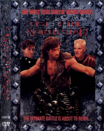
Fist of the North Star – Lionsgate really outdid itself with this one, and certainly wins the dubious honor of most illegible and visually camouflaged packaging. You’d swear from the confusing choice of thin dark red lettering on a blotchy dark grey background that this was a photocopied flea-market special, but astonishingly it’s actually the real deal from a major player in the industry. Could you have even have figured out what the title was if I hadn’t hipped you to it? I mean, check out the lettering on that spine, and imagine your head cocked sideways hunting a store shelf looking to buy this movie. Good luck!
Raise the Red Lantern – Sure, Gong Li‘s face may look like airbrushed mural on the side of someone’s van, or perhaps a black velvet painting being sold out of the back of a station wagon, but the fact is that MGM was actually trying to pass that retouched and “whitened” version of the actress as A PHOTO in this release of the 1991 arthouse hit. You just know some fat suits were sitting there in a meeting trying to figure out how to get middle America to buy a DVD starring Chinese people, and one of them went “I know! Let’s just paint her fuckin’ face white! Problem solved. Now, let’s get some lunch and hit a titty bar.”
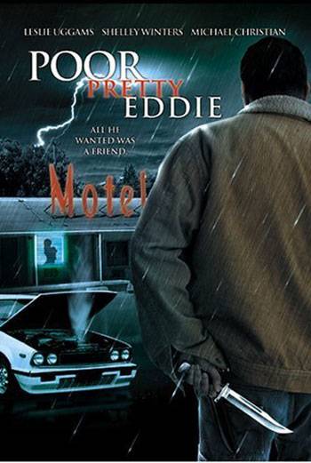
Poor Ugly Eddie – Or “Poor Ugly DVD Cover”. This is a prime example of a new image being made for an old movie that totally misrepresents what is actually in the film. For instance, it might surprise you to know that this movie doesn’t have a stormy night, a motel, that car, a short-haired guy with a knife, or a someone who “wanted a friend”. Which leaves… well, at least they got the title right. Sure, it has elements that are all kind of in that ballpark, but nothing that is directly related to this cover, which looks like it was lazily cut and pasted together by a bored teen net-nerd on his laptop with an out-of-date version of Photoshop. Give your head a shake, Trinity Home Entertainment. You’ve made an awesome southern-fried hicksploitation drive-in movie from the ’70s look like a cheap direct-to-video knockoff from the ’90s – a horrendous crime at least equal to the murder of a toddler, if not far, far worse.
Arlington Road – At first glance this cover isn’t in the same league-of-lame as the others, but I’m making an example of it to illustrate a point I need to get across. Younger readers may not remember this, but there was once a time when every drama that came out of Hollywood didn’t feature a photo of the two leads with half of their HUGE FUCKING HEAD in the light, and half of it in shadow. Since the early ’90s this tired old visual chestnut has served the industry very well, and they’re no doubt doing to milk it for as many decades as it somehow manages to keep drawing viewers into watching movies.
S&M Hunter – Perhaps it’s the exploitation movie dork in me, but I just expected so much more out of a cover for this tremendous Japanese sexploitation movie. First off, the kinky title refers to a stoic laso-packin’ bondage superhero who wears bowler hat, a priest’s collar and an eyepatch with a skull on it. Master of the infamous Kinbaku rope technique, he has whimpering victims hanging upside down from the ceiling in a crazy-intricate spider web of knots before they know what hit ’em. All of this gonzo superhuman bondage-weirdness culminates in an amazing ending I won’t spoil – but that involves a 200-foot crane, and needs to be seen to be believed. Frustratingly, nothing of what makes this movie so entertaining is properly promoted on this sad, sad, boring cover with it’s ugly fonts and uninspired layout. [Editor’s note: Robin was later contacted by the manufacturer and hired to do his own version using amazing tools, which you can see at the end of the post.]
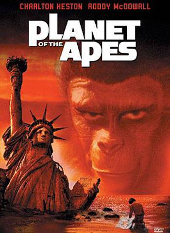
Planet of the Apes – AKA “Planet of the Spoilers”. The design and such is fine here, but the real atrocity to mankind is the flagrant spoilerism going on. Not to whine and complain, but is this not like a like a slap in the face? Sure, many people know the twist ending to this Charlton Heston classic already, but this DVD ensures that if you didn’t, it can’t possibly be a surprise for you now. Good going, 20th Century Fox – you morons.
Behold a Pale Rider – Or “Behold a Pale Turd”, more like it. This dribbling bung-bonanza nearly has me speechless. Look at Anthony Quinn’s eyes. Go on, take a close gander. HE’S WEARING A PAIR OF HIS OWN EYES. It’s like a paper mask he put on! And that isn’t his hand holding that luger! It’s the wrong colour and it’s coming from a very odd angle. I could complain as well about the fuckpump colorisation technique of black and white photos of the actors (which have been clipped and pasted together with fabric scissors and glue stick) – but why bother when Sony Pictures proudly has Anthony Quinn running around with a pair of his own eyes as flesh goggles?
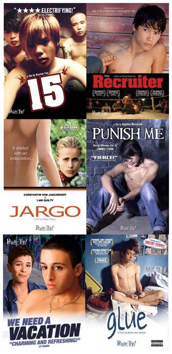
Picture WHAT? – A special “WTF award” goes to “Picture This!”, a company marketing their line of releases to the gay and lesbian demographic. Some of their movies are respectable gay-themed titles, but what they’ve also been doing is buying up the North American rights to modest foreign coming-of-age arthouse dramas, and then surreptitiously marketing them as underage sex films to gay pedophiles. This is damaging in more than one way: not only is it mismanaging and denying the films a real audience and no doubt frustrating pervs looking for some hot topless underage boy action, it’s also reinforcing very unfair and damaging stereotypes about all homos being kiddy-fiddlers. So fuck you, “Picture This!”, your underage boy DVD cover art sucks the soggy pustule-coated armpits of diseased baboons! Picture THAT.
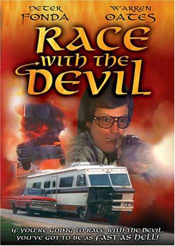
Ride With the Devil – Or failing, that, “Photoshop With the Devil”. Two vacationing couples witness a human sacrifice committed by a group of Satanists, and when they’re discovered, they too become the targets. Incredibly, it also seems the evil satanists cast some sort of suckage-spell on the DVD cover, because this thing ain’t easy on the eyes. I mean, what is going on here? That hokey font? The look on Peter Fonda’s face?! He looks like an inbred hillbilly Stephen Colbert! From this DVD cover, one could easily assume that this was a USA Network TV presentation that had totally bypassed theatres, not the beloved cult classic from 1975. Shame on you, Anchor Bay. Shame. On. You.
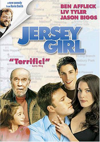
Jersey Girl – Where to start with Jersey Girl? There are plenty of reasons to fling donkey poo at this one, from the lame map of New Jersey as an uninspired backdrop, to George Carlin‘s expression, to Liv Tyler’s floating head, to the visual idiocy that is Kevin Smith peeking from inside the peeled back paper, to the fact that each figure on the cover is taken from a separate photo with redonkulous varying degrees of image quality. The final result is a pungent stew of snot, and yet another reason for me to dismiss Kevin Smith from the rollcall of creative individuals who matter – as I am wont to do regardless of the quality of his DVD packaging.
Robin Bougie’s cover for S&M Hunter:

Robin Bougie cover illustration for S&M Hunter.






4 responses to “Robin Bougie’s 10 Worst DVD Covers”